
Dashboard Analytics: A Practical Guide for Decision Makers
You open the operations dashboard on Monday morning and see that one region's revenue has slipped. A quick filter shows the problem isn't demand. First-call resolution has deteriorated, callbacks are piling up, and the local team is understaffed. By midday, you've rerouted coverage and given the manager a specific queue to fix.
That's dashboard analytics working properly. It isn't a collection of attractive charts or a monthly report with more filters. It's an operational decision layer that turns live business activity into a clear view of what needs attention, who owns the response, and how quickly someone must act.
The distinction matters because dashboard software can exist without dashboard adoption. Analyst research found that around 25% of employees were actively using BI and analytics tools on average in a 2021 survey of 214 data and analytics leaders, while Gartner separately described pervasive BI as reaching only about 30% of all employees. The figures are summarized in this dashboard analytics adoption overview, and they point to a practical lesson: deploying a dashboard doesn't mean people will open it, trust it, or change their behavior.
This guide treats latency, trust, and adoption as design requirements alongside KPIs and visual layout. It also considers when a dashboard should become an alert, a CRM panel, or an embedded decision instead of remaining a destination that employees must remember to visit.
What Dashboard Analytics Actually Means
A dashboard earns its place when it helps someone make a better decision before the opportunity or problem disappears. An operations lead might see falling regional revenue, trace it to slow first-call resolution, and move staff toward the affected queue. A clinic manager might notice tomorrow's schedule has too many unconfirmed appointments and start the reminder process immediately.
In plain language, dashboard analytics is the layer between operational data and operational action. It collects information from systems such as a CRM, phone platform, scheduling application, billing system, or warehouse, then frames that information around a role and a decision.
A useful working definition is:
Dashboard analytics combines continuously refreshed data, role-specific views, and decision-oriented metrics in an interface that helps a person act.
That definition separates it from several tools people often confuse with dashboards:
- A report answers a defined question at a point in time. It may explain what happened, but it usually doesn't support ongoing monitoring.
- A spreadsheet can be flexible and valuable, but it often depends on manual exports, local formulas, and individual knowledge.
- A BI platform provides the infrastructure for modeling, querying, and visualizing data. Dashboard analytics is the practical decision layer built with that capability.
- A dashboard displays information. A good dashboard analytics experience connects the information to an owner, threshold, workflow, or next step.
For example, a fleet manager needs more than a map showing vehicle locations. They need to know which vehicle is delayed, whether the delay threatens a customer commitment, and who should be contacted. A guide to real-time fleet visibility tools can help clarify how live operational context differs from a static location report.
The same principle applies to real-time analytics. Data that arrives continuously is useful only when the user understands its freshness, relevance, and consequence. A dashboard that updates quickly but leaves ownership unclear is still a reporting surface, not an operational system.
Anatomy of a Useful Analytics Dashboard
A car dashboard is useful because every instrument has a job. The driver doesn't need a gallery of visualizations. They need speed, fuel, warnings, and enough surrounding context to choose the next maneuver.
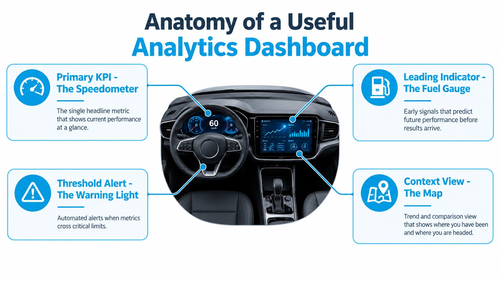
The four instruments
- Primary KPI, the speedometer: This is the headline measure of current performance. For a service team, it might be qualified bookings today. It should answer, “How are we performing right now?” without requiring a filter or drill-down.
- Leading indicator, the fuel gauge: Leading indicators show conditions that influence future results. Open opportunities, scheduled capacity, or unconfirmed appointments can reveal what is likely to happen before revenue appears.
- Threshold alert, the warning light: A missed-SLA alert should do more than turn red. It should create a callback queue, notify the responsible manager, or route a task to the team that can resolve it.
- Context view, the map: Trends, regions, products, and comparison periods explain where the number came from. A regional revenue tile set might show where advertising or staffing deserves attention.
The hierarchy should follow the decision. Put the primary KPI where it's seen first, supporting indicators nearby, and deeper context behind a clear path. Most dashboard design guidance recommends keeping the core screen to 5 to 10 meaningful KPIs and giving each page one primary question, as described in this analytics dashboard guide.
The details that create confidence
Every tile needs a timestamp, refresh status, and, where practical, its source system. “Revenue” without a period, source, or freshness indicator invites arguments instead of action. A filter bar should support self-service analysis without allowing users to create contradictory definitions, and a drill-down should move from summary to transaction in a small number of deliberate steps.
That is why a performance dashboard should be judged by its decision path, not its visual polish. For each panel, ask:
- Who acts on this?
- When should they act?
- What system or workflow receives the action?
A dashboard with no answer to those questions is probably collecting metrics rather than managing an operation.
Key Metrics and KPIs by Industry
The right KPI depends on the decisions your team owns. A clinic, law firm, and service business may all track conversion, response, and revenue, but the definitions and operational consequences differ.
Healthcare and dental clinics
A clinic can start with no-show rate, average patient wait, claim denial rate, and provider utilization. No-show rate informs reminder workflows and schedule protection. Average wait points to front-desk or clinical bottlenecks. Claim denial rate exposes revenue leakage in documentation or billing. Provider utilization helps the manager decide whether capacity is balanced.
The trap is optimizing one number in isolation. Low wait times can look positive while patients abandon the process before being seen, and high utilization can conceal staff strain or poor schedule flexibility.
Legal teams
A legal dashboard might include matter turnaround, billable realization, intake-to-engagement conversion, and lead source ROI. Matter turnaround helps partners identify aging work. Realization shows how much recorded work becomes collected revenue. Intake-to-engagement conversion reveals whether prospective clients move through the intake process. Lead source ROI supports decisions about marketing spend.
The common mistake is treating intake volume as success. A large number of inquiries means little if the team responds slowly, attracts poor-fit matters, or fails to convert qualified prospects.
Multi-location service businesses
For HVAC, plumbing, cleaning, or pest-control operations, useful measures include first-call resolution, average response time, conversion by location, and technician utilization. These metrics connect phone performance, booking behavior, local demand, and field capacity.
A manager should avoid celebrating total call volume when qualified bookings are falling. High technician utilization can also create longer response times and more callbacks if dispatchers are filling every available slot.
Use the following as a starter set to pressure-test against your own funnel over the next thirty days. Keep a metric only if someone can explain the decision it changes.
| Industry | Metric | Decision it informs | Common trap |
|---|---|---|---|
| Healthcare or dental | No-show rate | Whether to adjust reminders or schedule buffers | Treating a low rate as proof that every patient experience is healthy |
| Healthcare or dental | Claim denial rate | Whether billing or documentation needs review | Measuring submitted claims without checking collection outcomes |
| Legal | Intake-to-engagement conversion | Whether intake handling produces retained matters | Chasing inquiry volume instead of qualified engagement |
| Legal | Matter turnaround | Where work is aging and partner attention is needed | Averaging all matters together and hiding difficult cases |
| Multi-location service | First-call resolution | Whether staff can solve demand without repeat contact | Counting answered calls without checking customer outcomes |
| Multi-location service | Conversion by location | Where local marketing or staffing should change | Comparing locations without normalizing their operating context |
Beyond Static Dashboards and Embedded Intelligence
A monthly PDF can answer, “What happened?” It can summarize revenue, staffing, or campaign performance for a scheduled review. It fails when the question is, “What just happened, and who needs to respond?”
Dashboard analytics now works best when the delivery format matches the decision cadence. There are three practical choices.
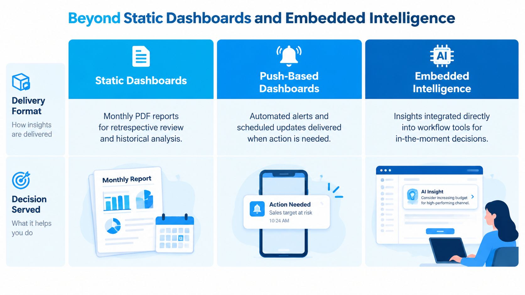
Static dashboards
Static dashboards support retrospective review. An executive may use one to compare a completed period, review departmental performance, or prepare for a planning meeting. The screen can contain more historical context because the user has deliberately opened it for analysis.
This format is appropriate when the decision is scheduled and the data doesn't need to trigger an immediate response. It becomes wasteful when frontline employees must repeatedly check it for exceptions.
Push-based dashboards
Push-based analytics sends information into channels where the team already works. A support manager might receive a Slack or email notification when abandonment crosses a defined threshold. A multi-location retailer might receive an exception message when a store's conversion or staffing measure moves outside its acceptable range.
The mechanic is straightforward. Assign a numeric threshold to a metric, define the delivery channel, and specify the response owner. Guidance on automated web analytics alerts describes this pattern using threshold notifications for channels such as email and Slack.
Embedded intelligence
Embedded intelligence places the insight inside the workflow. Call analytics can appear on a CRM record, revenue context can sit inside a scheduling application, and a recommendation can appear while an employee is completing the task that generated the data.
This model reduces context switching, but it depends on clean integration and clear permissions. Real-time data sync is useful when the business needs a consistent state across operational tools rather than another isolated reporting destination.
Practical test: If nobody changes behavior when the dashboard changes, the delivery format is wrong, the metric lacks ownership, or the signal isn't important enough.
Design Principles and Data-Visualization Rules
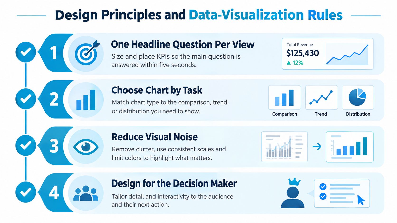
Good visual design reduces the time between seeing a signal and understanding its meaning. It doesn't turn weak definitions into useful KPIs, so start with the question before choosing the chart.
Start with one question
Give each view one headline question, such as “Are we meeting today's booking target?” Size and position the primary KPI so a user can answer within five seconds. Supporting measures should explain the headline, not compete with it.
A KPI also needs a target, threshold, owner, and consistent time window. Comparing month-to-date with a prior full month creates confusion. Use clearly labeled periods such as last seven days, month-to-date, or quarter-to-date, following the practical guidance in this KPI dashboard resource.
Match the visual to the task
Use a line chart for a trend over time, a bar chart for comparisons, a single number with a delta for current status, and a table when exact values matter more than visual patterns. A line chart can show daily calls received, while a table below it lists exact counts by location or agent, an approach outlined in this dashboard visualization guide.
Avoid 3D effects, unnecessary dual axes, and rainbow palettes. These choices add decoration without improving interpretation.
Make trust visible
Show the data freshness timestamp, source system, and last-recalculation latency on each important tile. Use color consistently, so red always signals below target and green always signals acceptable performance. Give the layout enough whitespace that users can distinguish hierarchy without decoding a crowded screen.
A reusable legend helps teams interpret colors, statuses, and abbreviations consistently. On mobile, test whether labels remain readable, filters remain usable, and the primary decision still appears before secondary detail.
Use this audit before publishing:
- Question: Can the user state the main question in one sentence?
- Chart: Does each visual match a trend, comparison, status, or lookup task?
- Color: Does every color have a stable meaning?
- Freshness: Can the viewer see when the data last refreshed?
- Source: Is the originating system identified?
- Mobile: Can the owner act from a phone without losing essential context?
Blueprint Examples for Real Businesses
The same dashboard skeleton can serve very different operations. The organs change, but the structure remains: headline performance, leading conditions, an exception signal, and enough context to choose a response.
A dental clinic
A dental clinic with two operatories could open a morning view containing yesterday's production, today's scheduled revenue, no-show rate, and pending insurance claims over the last seven days. Scheduling data supplies appointments, the practice management system supplies production and claims, and the phone system supplies reminder outcomes.
The primary visual might use single-value cards for today's schedule and a line chart for no-shows. A table can list pending claims by payer. The owner's phone receives one alert when the no-show measure crosses its agreed threshold, with the office manager responsible for the follow-up.
A multi-location HVAC business
An HVAC operator can combine dispatch, CRM, phone, and technician systems to monitor first-time-fix rate, average ticket, call-to-dispatch minutes, and technician utilization. Location filters allow regional managers to compare operations, while a callback heatmap identifies clusters that need training or parts planning.
The main page should emphasize response and booking performance. A drill-down can connect a callback to the original job, technician, location, and call outcome. One phone alert can flag a sustained deterioration in first-time-fix performance at a location, rather than notifying the owner about every individual job.
A mid-sized law firm
A law firm might bring together its intake platform, timekeeping system, billing data, and matter-management system. The dashboard can show intake-to-engagement conversion, billable hours per attorney, realization rate, and matter-aging buckets, with partner-only slices for sensitive financial information.
A funnel visual suits intake conversion, a bar chart compares attorney workload, and a table supports matter lookup. The alert should focus on an actionable exception, such as an aging matter requiring partner review, not just a high count of open files.
| Element | Dental Clinic | HVAC Service Business | Law Firm |
|---|---|---|---|
| Data sources | Practice management, scheduling, phone, claims | CRM, dispatch, phone, technician system | Intake, timekeeping, billing, matter management |
| Primary KPIs | Scheduled revenue, production, no-shows | First-time fix, average ticket, response time | Engagement conversion, realization, matter aging |
| Context view | Claims by payer and no-show trend | Location filter and callback heatmap | Attorney comparison and aging buckets |
| Owner alert | No-show threshold | Location performance exception | Matter requiring partner review |
Integration and Automation With CRMs and Call Systems
Dashboard analytics should consume operational data rather than become another silo. Start by listing the systems of record: CRM, scheduling platform, phone or PBX system, billing application, and any field-service or case-management tool.
Build the data path deliberately
First, define the events that matter. These might include a new lead created, a missed call, an appointment booked, an invoice paid, a job dispatched, or a matter engaged. Then identify the fields needed to connect events, such as contact ID, location, lead source, call outcome, appointment status, and owner.
Connect each source through the simplest reliable method available:
- Native connector: Use a maintained integration when the source already supports the required fields and refresh behavior.
- Webhook: Use event-driven delivery for call outcomes, bookings, or status changes that need prompt visibility.
- Scheduled CSV drop: Use a controlled batch process for systems that don't expose a suitable connector or API.
An overview of CRM integration can help teams think through how records, events, and workflows should move between systems rather than copying isolated fields.
Separate live events from batch facts
Call queues and live bookings may need frequent updates. Revenue, retention, and some billing measures may update on a nightly cadence. Put both on one dashboard only when each tile clearly shows its own freshness. Otherwise, users assume the entire screen is current when only one data stream is.
Small automations compound over time:
- Tag call outcomes: Attach answered, missed, booked, or follow-up outcomes to the original lead source.
- Enrich CRM records: Add call summaries, disposition, and next action to the contact or opportunity.
- Refresh on activity: Trigger a dashboard update when an event changes a decision-critical metric.
- Reconcile ownership: Define which system controls customer identity, appointment status, revenue, and call activity.
Source conflicts are normal. A CRM may own opportunity status while the phone platform owns call disposition. Write that hierarchy down, assign one authoritative source per field, and expose exceptions rather than overwriting values.
Implementing Dashboard Analytics and Measuring Impact
A practical rollout can fit into a 30-day plan if the team limits scope and starts with decisions rather than decoration.
Foundation from days 1 to 10
Choose 3 to 5 primary KPIs, document their definitions, and clean the source connections. Interview the people who will act on the numbers. If they can't identify a decision, owner, and response window for a metric, leave it out.
Launch from days 11 to 20
Release a first dashboard to a small user group. Watch where people hesitate, export data, dispute definitions, or ignore panels. Remove any metric that doesn't change a decision, then add freshness indicators and exception handling before expanding access.
Scale from days 21 to 30
Embed the useful views into daily tools, expand access by role, and establish review cadences. Schedule a short operational review for recurring decisions, while routing urgent exceptions through alerts or workflow tools instead of waiting for the next meeting.
Measure three signals:
- Adoption: Track weekly active viewers, time on screen, and queries run. Usage should reflect real work, not passive logins.
- Latency: Measure how soon after an event the dashboard reflects reality. For interactive dashboards, evaluate tail latency at p95 or p99 rather than relying only on averages. A practical benchmark cited for dashboard queries is p95 at or below 1.5 seconds, with 99% of rows queryable within 5 minutes, as described in this data-platform performance benchmark.
- ROI: Record decisions made faster, issues caught earlier, and hours reclaimed from manual reporting.
Slow dashboards often fail because of the full path, including database work, semantic processing, network transfer, and browser rendering. Pre-aggregation, materialized views, query rewrites that remove exploding joins or unnecessary DISTINCT operations, and cache TTL tuning can address different parts of that path. One documented real-time dashboard benchmark reduced load time from 8 seconds to under 200 milliseconds after architectural changes while processing 10 million events per hour, as reported in this real-time analytics dashboard engineering example.
The failures are predictable: data nobody trusts, refreshes too slow to support action, or a dashboard reviewed only in monthly meetings. Design around those risks from the first metric definition.
Recepta.ai provides real-time analytics for call performance, costs, trends, and system activity, while connecting conversation outcomes with CRMs, calendars, and other business tools. Visit Recepta.ai to see how call data can become an actionable part of your dashboard analytics workflow.