

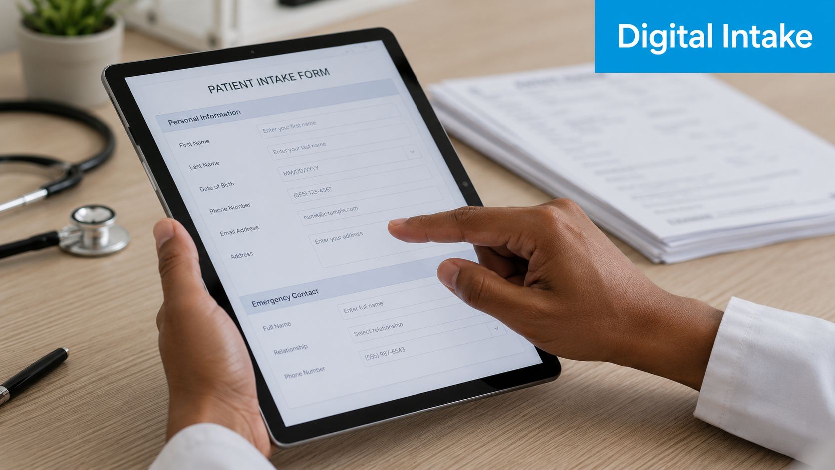
The Perfect Patient Intake Form Template for 2026
A lot of clinic owners are living the same morning, over and over. The schedule is full. A new patient arrives five minutes late. The clipboard comes back with half-legible handwriting, a missing insurance group number, and “blood pressure meds” written where the care team needs the medication name, dose, and frequency. Then your front desk staff retypes everything, asks follow-up questions at the window, and hopes nothing important gets missed before the claim goes out.
That's not just an annoying check-in routine. It's a weak point in your revenue cycle, your patient experience, and your clinical workflow. A good patient intake form template helps. An intelligent intake system does much more. It catches bad data early, adapts to specialty needs, feeds the right systems, and gives providers usable information before the visit starts.
Why Your Old Intake Form Is Costing You Time and Money
Paper forms create work twice. Patients write the information once, then staff re-enter it. Every handoff is another chance for a typo, a missing field, or a billing issue that didn't need to happen.
The urgency is easy to see in the market. The global patient intake software market is projected to reach $5.66 billion by 2033, while practices move away from manual workflows where data entry errors historically reached 20%. Digital intake templates have been shown to reduce those errors to 0.67% according to Dialog Health's digital patient intake statistics.
What manual intake actually costs
The visible cost is front-desk time. The less visible cost is downstream damage.
- Billing friction: Demographic mistakes, subscriber errors, and incomplete policy details can delay or derail claims.
- Clinical delays: Providers start visits by clarifying intake instead of treating the patient.
- Patient frustration: People don't enjoy repeating the same information on paper, at the desk, and again in the exam room.
- Staff burnout: Your best employees end up doing transcription and cleanup work.
Practical rule: If your team has to “fix” intake after submission, your form isn't doing its job.
A common misstep for many clinics involves replacing a paper packet with a fillable PDF and calling it modernization. That's an improvement, but it's still a static document. It still depends on the patient knowing what to enter, it still misses real-time checks, and it often still creates rework.
The better standard
A modern patient intake form template should act like an operational filter. It should collect complete data, guide the patient in plain language, and route information into scheduling, billing, and clinical systems without another round of manual cleanup.
If you're thinking beyond forms and into workflow design, it helps to look at teams focused on building and scaling healthcare solutions that connect intake to the rest of practice operations. Intake only works when it isn't isolated.
Patient experience improves too, but not because the form “looks nicer.” It improves because fewer things go wrong, fewer questions get repeated, and patients spend less time waiting for your office to untangle preventable mistakes. That same operational mindset shows up in better communication, reminder flows, and front-desk responsiveness, which is why many clinics also rethink the broader patient experience across the visit journey.
Anatomy of an Effective Patient Intake Form
A strong patient intake form template has one job: collect information that staff can trust and clinicians can use immediately. That means each section must exist for a reason. If a field doesn't support treatment, scheduling, billing, compliance, or follow-up, remove it.
Start with the visual blueprint below.
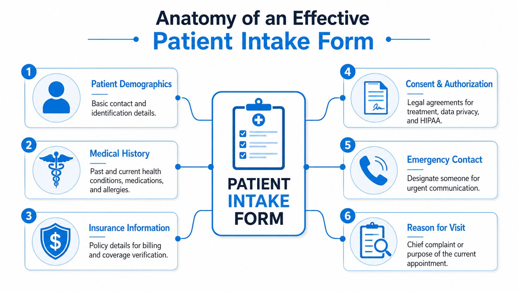
The six sections every template needs
The core structure is simple, but the wording matters.
| Section | What it should capture | Practical example |
|---|---|---|
| Patient demographics | Legal name, date of birth, contact details, preferred communication method | Label the mobile number field with a short note such as appointment reminders |
| Insurance information | Payer name, member ID, group number, subscriber details | Separate member ID from group number so patients don't combine them |
| Medical history | Conditions, surgeries, medications, allergies | Use distinct fields for medication name, dose, and frequency |
| Consent and authorization | Treatment consent, privacy acknowledgment, financial policy acknowledgment | Require active agreement instead of burying terms at the bottom |
| Emergency contact | Name, relationship, phone number | Make this easy to skip only if your policy allows |
| Reason for visit | Main purpose of today's appointment | Ask for the patient's own words first |
The most common design mistake is flattening everything into one long list of questions. That creates noise. Patients rush. Staff skim. Providers get a chart that's technically complete but operationally weak.
Separate chief complaint from symptom checklist
These are not the same thing.
The chief complaint should capture the patient's main reason for coming in, in their own words. A symptom checklist should organize related details after that. If someone writes “right knee pain after a fall,” that's the chief complaint. A checklist can then ask about swelling, instability, locking, pain severity, or weight-bearing difficulty.
When clinics merge these into one vague prompt, the result is usually thin data. Providers then start the visit by reconstructing the story from scratch.
Keep the open-text concern first. Use structured follow-ups second. That preserves clinical nuance without sacrificing clean documentation.
Plain language beats jargon
Many forms still use language that belongs in a chart note, not in a patient-facing document. That's a mistake. Expert analysis shows that when patients encounter medical jargon like “dyspnea” instead of “shortness of breath,” reporting accuracy drops by up to 40%. The same analysis also shows why clearly labeled Current Medications and Allergies fields matter so much for clinical decision support.
That has direct form-writing implications:
- Use everyday wording: “Shortness of breath” works better than “dyspnea.”
- Ask layered questions: Don't ask “medications” in one blank box. Ask for name, dose, and frequency.
- Get allergy detail: “Penicillin” isn't enough by itself. The reaction matters too.
A clean data structure also improves what happens after submission. If your intake platform pushes information into your chart or admin tools, the fields need to map cleanly. That's where real-time data sync across patient communications and workflows becomes important. A neat form isn't useful if staff still have to copy information between systems.
A quick walkthrough helps illustrate the difference in practice.
What works and what fails
What works
- A short opening section with identity, contact, and visit purpose
- Conditional follow-up questions based on prior answers
- Distinct medication and allergy fields
- Simple, patient-friendly labels
- Consent items that require active acknowledgment
What fails
- Giant text boxes for clinically important information
- Combined insurance fields
- Jargon-heavy prompts
- Repetitive questions asked in multiple sections
- Forms that collect data no one uses
Customizing Templates for Your Medical Specialty
A base patient intake form template is necessary. It isn't sufficient. General medical, dental, and behavioral health practices don't need the same follow-up questions, and pretending they do creates bad data.
This is also where static templates start breaking down operationally. A 2025 report found that 42% of small clinics waste 3 to 5 hours weekly reconciling mismatched form fields across specialties, which contributes to 18% higher billing denial rates when generic forms miss specialty-specific data, according to DeepCura's patient intake form analysis.
Use one core form and add specialty layers
The smartest setup is not maintaining totally separate forms from scratch. It's building one core intake structure with locked compliance and identity fields, then adding specialty modules that appear only when relevant.
That gives you consistency where you need it and flexibility where you don't.
| Specialty | Core fields stay the same | What should change |
|---|---|---|
| General medical | Demographics, insurance, medications, allergies, consent | Preventive history, chronic conditions, lifestyle questions |
| Dental | Demographics, insurance, medications, allergies, consent | Dental pain history, prior dental work, grinding, tooth-specific concerns |
| Behavioral health | Demographics, insurance, medications, allergies, consent | Screening tools, current supports, safety questions, therapy history |
General medical needs breadth without clutter
Primary care and family medicine forms often become bloated because practices try to ask everything up front. That's a mistake. You want enough context to prepare for the visit, not an intake packet that feels like a full annual history every time.
A practical general medical module might include:
- Preventive context: Tobacco use, alcohol use, exercise habits, and relevant screening history
- Chronic condition prompts: Diabetes, hypertension, asthma, thyroid disease, and a free-text “other”
- Visit-specific branching: If the patient selects digestive issues, reveal symptom timing and severity questions
A common fix I recommend is separating “history we need once” from “updates we need today.” New patients can complete the full intake. Established patients can review prefilled core data and answer a shorter visit update.
Dental requires treatment-specific details
Dental practices often rely on generic medical forms plus a few handwritten notes. That leaves gaps. A dental intake template should collect oral health information in a way the team can act on before the patient sits in the chair.
Useful additions include:
- Pain location and duration
- History of crowns, implants, root canals, or extractions
- Grinding or clenching habits
- Sensitivity to hot, cold, or sweets
- Concerns about prior anesthesia reactions
If you serve dental offices, it also helps to think about how intake connects to reminders, scheduling, and front-office follow-up in a workflow designed for dental practice operations and patient communication. The form itself is only one part of the handoff.
A dental intake form should help the assistant and provider prepare the room, not just satisfy paperwork.
Behavioral health needs careful wording and pacing
Behavioral health intake fails when it feels cold, rushed, or overly administrative. Patients are disclosing sensitive information. The form should support that without sounding vague or clinical in the wrong way.
A stronger behavioral health module usually includes:
- Presenting concern in the patient's words
- Current symptoms and duration
- Validated screening tools such as PHQ-9 when appropriate to the practice
- Past treatment history
- Current medications and prescribing provider
- Support system and living situation
The wording matters here more than almost anywhere else. “Who do you live with?” is more useful and less alienating than a broad social-history text box. “Have you had counseling before?” gets better answers than “Prior psychiatric interventions.”
Build rules, not just forms
The right long-term model is dynamic form architecture. That means your system should:
- Lock core compliance fields: Demographics, required disclosures, insurance basics
- Inject specialty questions conditionally: A pediatric patient gets guardian and developmental prompts. A women's health visit can reveal menstrual history only when relevant
- Keep naming consistent across versions: “Policy number” shouldn't become “member number” in one template and “subscriber ID” in another unless there's a payer-specific reason
- Map each answer to the right destination: Clinical details to the chart, insurance data to billing, consent records to compliance storage
That approach reduces the maintenance headache that comes from juggling too many disconnected forms and cuts down on rework at the desk.
Navigating HIPAA Compliance and Patient Consent
Compliance problems rarely start with dramatic security failures. They usually start with ordinary sloppiness. A missing acknowledgment. A consent section buried in fine print. A mobile form button that's too small for a patient to tap accurately. Those details matter because a compliant intake process must also be usable.
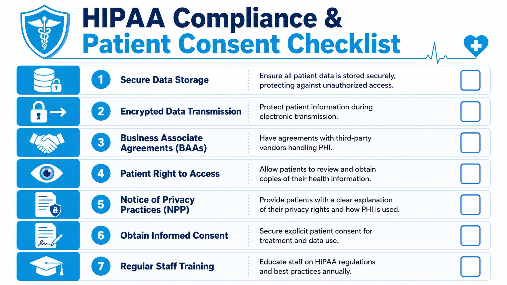
Consent should be active, not passive
A patient intake form template should clearly separate at least four kinds of acknowledgment:
- Consent for treatment
- Notice of privacy practices acknowledgment
- Financial responsibility acknowledgment
- Authorization for release of information when applicable
Don't hide these in one dense paragraph at the bottom of the page. Use distinct sections and require an active checkbox or signature step where appropriate. That creates a clearer record and reduces future disputes about what the patient saw.
A practical example is your cancellation policy. If it sits in a block of text after the insurance section, many patients won't absorb it. If it appears as a short, standalone acknowledgment, staff can point to a clear acceptance record later.
Accessibility is part of compliance
Digital intake has to work for patients with limited dexterity, low vision, or those completing forms on a phone. To meet ADA expectations, clickable elements like buttons should be at least 0.5 by 0.5 inches (36pt x 36pt). Adhering to these and related WCAG 2.2 benchmarks can improve patient onboarding efficiency by 15 to 20% by making the form usable for more people.
That means the right patient intake form template should include:
- Large touch targets: Buttons and checkboxes sized for mobile use
- Readable text: Body copy at a readable size, with strong visual contrast
- Clear labels: Every field should have a visible label, not just placeholder text
- Logical reading order: Especially important for screen readers and assistive technologies
Compliance gets easier when the form is easy to understand, easy to tap, and hard to misread.
A short compliance checklist for intake design
| Area | What to check |
|---|---|
| Privacy | Patients can review privacy practices and acknowledge receipt |
| Treatment consent | Consent language is clear and specific to services offered |
| Financial policy | Payment expectations and responsibility are actively acknowledged |
| Accessibility | Buttons, checkboxes, text size, and layout work on mobile and assistive tools |
| Storage and transmission | Patient data is handled through secure systems with proper vendor agreements |
If you're evaluating the broader workflow around intake, reminders, and appointment handling, it helps to compare your setup against practical guidance for HIPAA-compliant scheduling software in healthcare operations. Intake rarely exists alone. It shares data and responsibilities with the rest of your front office systems.
Moving Beyond Paper to Intelligent Digital Intake
A digital PDF is not an intelligent intake process. It's just paper on a screen.
The upgrade happens when the form starts doing work before a staff member touches it. It should validate entries, branch based on patient responses, and send the right data to the right system without another round of manual review.
What intelligent intake does differently
A 2024 AHIMA study found that nearly 30% of clinical intake errors stem from unverified insurance or medication details, and 65% of clinics lack instant validation tools needed to catch those mistakes during submission, as summarized in Patient Talker's review of intake form trends.
That gap explains why so many “digital” check-in systems still produce rework. They collect information, but they don't verify it.
Here's what a stronger system should do:
- Validate insurance fields during entry: If the patient leaves the group number blank or enters the wrong format, the form should prompt for correction before submission.
- Clarify medication data in real time: If someone enters a medication name without dose or frequency, the form should ask follow-up questions immediately.
- Reveal only relevant fields: A patient with no allergies shouldn't see a long allergy detail section.
- Route completed data automatically: Insurance to billing review, medications and allergies to the clinical record, signed acknowledgments to compliance storage.
Static forms collect data. Intelligent forms prevent bad data.
This distinction matters. Most intake problems don't come from missing forms. They come from forms that allow incomplete, ambiguous, or mismatched answers.
Consider two versions of the same question.
| Static form | Intelligent form |
|---|---|
| “List your medications” | “Enter medication name, dose, and frequency for each medication” |
| “Insurance info” | Separate fields for payer, member ID, group number, subscriber name, with required formatting |
| “Any allergies?” | If yes, reveal allergen and reaction type fields |
| One generic packet | Specialty-based logic reveals visit-specific questions |
That's also where integration starts paying off. If your scheduling, intake, and follow-up tools are separate, staff end up chasing patients for missing details. If those systems talk to each other, booking can trigger the right forms automatically. In practical terms, that might mean sending a welcome packet the moment a new appointment is created, or following up on incomplete submissions before the patient arrives. Tools such as Google Forms can serve as a basic starting point, while platforms like Recepta.ai can automate intake delivery and follow-up as part of the communication workflow.
The best intake system is the one your staff doesn't have to babysit.
Download Your Templates and Plan Your Digital Upgrade
If your clinic still relies on clipboards or static documents, start with templates. They're a useful first step. A solid patient intake form template for general medical, dental, or behavioral health can immediately improve structure, consistency, and readability.
Build your first version with these priorities:
- Keep one core form: Demographics, insurance, medications, allergies, reason for visit, emergency contact, and consent.
- Add specialty modules: Dental history, behavioral health screening, pediatric guardian details, or other visit-specific sections.
- Rewrite every patient-facing question in plain language: If a patient has to guess what you mean, the field needs work.
- Turn critical blanks into structured fields: Medication name, dose, frequency. Allergen and reaction. Policy number and group number.
- Plan the handoff: Decide what gets reviewed by front desk, billing, and the clinical team before the visit starts.
If you run a psychology practice or support regulated mental health workflows, it's also worth reviewing an AHPRA compliance solution for psychologists to see how intake, documentation, and compliance expectations connect in practice.
The key is not stopping at the template.
Templates organize information. Intelligent intake systems reduce correction work, improve data quality, support accessibility, and make the first interaction feel far more competent. That shift matters to patients, but it also matters to your staff and your margins. When intake becomes structured, adaptive, and connected to the rest of your systems, the whole clinic runs with less friction.
If you're ready to move beyond static forms, Recepta.ai can help automate patient communication around intake, including sending digital forms after booking, following up on incomplete submissions, and keeping scheduling conversations connected to your front-office workflow.